The most dangerous moment in any rebrand is the day the new logo looks great in the boardroom. That’s when a business is most likely to throw away the one thing it can’t buy back: recognition. Years of being known — by customers, by partners, by the regular who’s been coming back since before you had a website — is an asset, and a rebrand that ignores it isn’t bold. It’s expensive amnesia.
An established business in the Philippines carries equity that a new one would spend years and millions to build. The temptation, when growth stalls or the brand starts to feel dated, is to wipe the slate and start fresh. But “fresh” and “unrecognisable” are easy to confuse, and confusing them is how a rebrand loses the customers it was meant to keep.
This is the discipline a rebrand actually requires: knowing, before you touch anything, exactly which parts of the brand are carrying the trust — and refusing to redesign those for the sake of looking new.
Why most rebrands fail — and it isn’t the design
Most failed rebrands aren’t failures of taste. The new identity often looks better than the old one. They fail because they treat recognition as something to be replaced rather than inherited.
An established brand has spent years training its market to recognise it instantly — a colour glimpsed across a mall, a logo on a delivery truck, a name passed from parent to child. That instant recognition is doing quiet, valuable work every single day. When a rebrand discards it in favour of something cleaner, the business doesn’t read as “modern.” It reads as “new,” and new means unproven. Customers who trusted the old brand on reflex now have to think — and a customer who has to stop and think is a customer you’ve made a little less loyal.
The failure, in other words, is strategic, not visual. The design is fine. The decision about what to keep was never made.
What to protect before you change anything
Before a single new element is designed, a rebrand should produce a short, honest list: what here is carrying the trust?
It’s usually fewer things than people expect. Sometimes it’s the name and nothing else. Sometimes it’s a specific colour so tied to the brand that customers describe the company by it. Sometimes it’s a mark, or even just the shape of a mark, that people recognise faster than they read the name. These are the load-bearing elements. Everything else — the typography, the layout, the tone, the supporting palette, the way it all behaves across a website and a storefront and an app — can and often should be rebuilt.
The exercise that matters is separating equity from habit. A brand accumulates a lot of visual baggage over the years that survives simply because no one questioned it, not because customers are attached to it. The skill in a rebrand is telling the difference: protecting what genuinely carries recognition, and freely modernising everything that’s just there out of inertia.
This is also where a brand identity system earns its place. Once you know what to keep, you need a system that lets the refreshed brand scale across every modern touchpoint without drifting — the same discipline we cover in What a Brand Identity System Actually Is.
How to modernise without erasing — evolution over reinvention
The right model for most rebrands is evolution, not reinvention. You keep the recognisable anchors and rebuild the system around them so the brand feels current without feeling like a stranger.
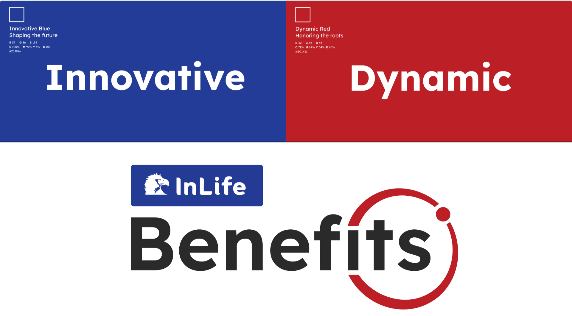
A clear example from our own work is Digital Alchemy — an Australian business, which is rather the point: preserving trust through a rebrand isn’t a Filipino problem or an Australian one, it’s a rebrand problem, and the same discipline solves it in any market. We kept exactly three things: the name, the existing logo, and the yellow the brand was known for. Everything else was open. We refreshed the visual identity around that fixed centre, introducing colours beyond the signature yellow while leaving the mark people already recognised untouched. The recognition stayed put; the look around it moved forward.
For a business in the Philippines the logic is identical. The colour stays but gains a disciplined, screen-ready palette around it. The mark stays but finally gets the rules it never had — proper clear space, a version that works at favicon size, a treatment that survives on a dark background. The name stays, and a coherent voice and typographic system gives it a consistent way to speak. To a loyal customer the brand still looks like itself, only sharper. To a new one, it looks like a company that has its act together.
That balance — recognisable to the people who already trust you, credible to the people who don’t yet — is the whole job. Reinvention chases the second group and forgets the first. Evolution serves both.
Frequently Asked Questions
How do I know if my business needs a full rebrand or just a refresh?
If customers still recognise and trust your brand but it looks dated or breaks down across digital channels, you likely need a refresh — keep the recognisable anchors, rebuild the system. A full rebrand makes sense only when the business itself has fundamentally changed, such as a merger or a complete shift in what you offer.
Will rebranding confuse my existing customers?
It can, if the rebrand discards the elements customers recognise. A well-planned legacy rebrand protects those anchors — the name, a signature colour, a familiar mark — precisely so existing customers still recognise you. Done right, they notice the brand looks sharper, not that it became a different company.
What parts of a brand are usually worth keeping in a rebrand?
Most often the name, any signature colour customers strongly associate with the business, and a mark or shape people recognise on sight. These carry the earned trust. Typography, layout, supporting colours, and tone can almost always be modernised freely.
How long does a rebrand take for an established business in the Philippines?
It depends on scope, but a rebrand that includes a full identity system and digital applications typically runs over several months rather than weeks, because the work spans strategy, design, documentation, and rollout across every touchpoint the brand appears on.
Conclusion
A legacy rebrand isn’t a chance to start over. It’s a chance to look like the best version of who you’ve always been — which means the first job isn’t designing anything. It’s deciding what not to touch. Get that decision right and everything downstream becomes easier: you can modernise aggressively because you’ve already protected the things that can’t be replaced.
The businesses that rebrand well in the Philippines aren’t the ones that change the most. They’re the ones that knew exactly what to keep. Looking new is easy. Looking new while still looking like yourself is the entire art.