Asian Development Bank / Annual report, microsite and PDF
Annual report design for a readership that never reads it the same way
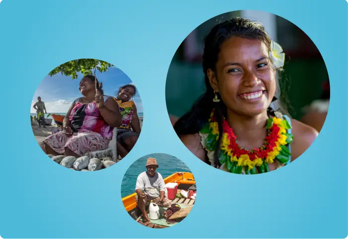
The Asian Development Bank documents some of the most consequential development work in Asia and the Pacific: programs that stabilize fragile states and support small island nations facing climate change, conflict, and systemic poverty. The 2024 Annual Report on FCAS and SIDS is that work made visible.
FCAS is Fragile and Conflict-Affected Situations. SIDS is Small Island Developing States.
We've partnered with ADB since 2020, and this is the fourth annual report in that partnership. It's also the most technically rigorous and creatively ambitious of the series.
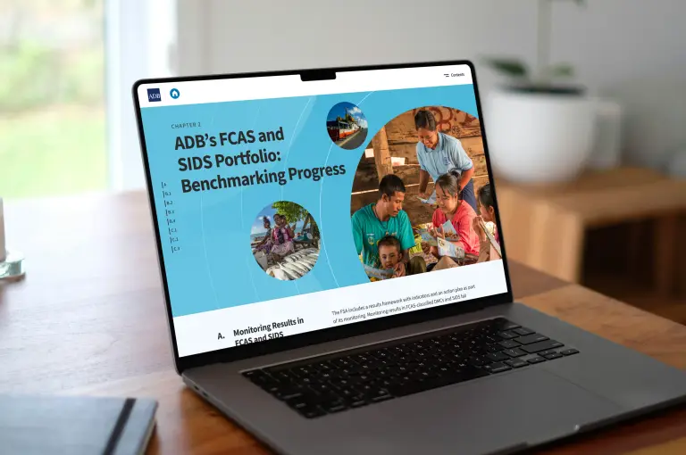
We do annual report design in the Philippines for institutions that publish under strict brand rules. For ADB, we designed and built the interactive microsite, and we designed the official PDF publication.
The problem
The report reaches policymakers in Manila, development workers across the Pacific, academics in Washington D.C., and civil society organizations throughout Asia. They don't read it the same way at all. Some read cover to cover. Others arrive for a single statistic and leave. Some open the report on a high-speed desktop connection, and others on a mobile device in a low-bandwidth environment.
A single reading experience had to hold all of them at once. The 2024 edition also marked a milestone in ADB's multi-year FSA implementation plan, so the report had to feel like a culmination rather than a routine yearly update, and the design had to carry that weight.
The technical brief didn't leave much room to improvise. Every data visualization and chart had to animate, work for screen readers, and comply with WCAG accessibility standards. Typography and color had to follow ADB's institutional brand guidelines precisely, a system that grants very little creative latitude.
What we did
The creative concept came from a single image: ripples. One action, whether a policy decision or a development intervention, spreads outward and reaches communities far beyond the point of contact. It's visually expressive, and it's true to the way ADB's work actually travels.
That idea became the organizing principle for both deliverables. The microsite moves with gentle radiating motion. Data visualizations animate outward from a central point, and section transitions carry a sense of expanding reach. The PDF picks up the same rhythm through layout geometry and spatial hierarchy, so a reader who moves between the digital and printed versions stays inside one coherent experience.
Working inside a tight brand system still leaves you real decisions: where a chart should breathe, how long a transition should hold, which stories deserve visual gravity rather than a table and a footnote.
What we built
An interactive microsite for a global readership
The microsite is fully responsive and optimized for mobile first, which was a deliberate call given how development workers and government partners in FCAS and SIDS countries reach digital content. Navigation works for the reader going through the report in order, and for the one who lands straight on a single section.
Animated data that a screen reader can follow
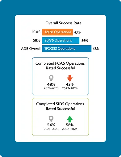
Data and graphs animate on scroll, so a reader takes in one figure at a time instead of meeting a page of numbers at once. We built every visualization to be screen-reader compatible and keyboard-navigable, then tested each one for color contrast. All of it sits inside ADB's institutional color palette and typographic system. We didn't take creative shortcuts to make the brand rules easier to work with.
The official PDF publication
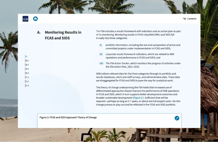
Alongside the microsite, we designed the official PDF edition, the document that circulates to ADB member governments, development partners, and the wider international development community. It's a different discipline from a website. The layout is fixed, the precision has to be print-ready, and the reading experience has to stand on its own without a single interactive element to lean on.
We treated it as an extension of the same visual language, carrying the ripple concept through layout geometry, section pacing and graphic hierarchy. We held to ADB's brand standards throughout, from font usage to grid systems to icon treatment. The two formats sound the same even though they're read in completely different ways.
The proof
Four consecutive annual reports for ADB since 2020, each one more complex than the last. Every chart on the microsite is animated, screen-reader compatible, keyboard-navigable, and WCAG compliant, all of it built inside ADB's institutional brand system.
An annual report for a multilateral development institution is an accountability document. It's read by the people who fund development programs, the governments that implement them, and the communities who depend on them. Getting the design right, technically and visually and in accessibility, is part of the institution's credibility.
We're a boutique agency in Salcedo Village, Makati, and we take on few enough projects that a report like this stays with the same people from scope to build. Four years of consecutive projects with ADB have produced a partnership grounded in trust and technical rigor, and in a shared view of what this subject matter deserves.
Annual report design, from the brief to a published site and PDF
If you publish a report that has to satisfy a brand system and an accessibility standard, and reach a readership arriving from everywhere, we've built exactly that four times over. Show us what's going out this year and we'll come back with how we'd structure it in digital and print form.
ClientAsian Development Bank (ADB)
IndustryMultilateral development institution
ProjectFCAS and SIDS Annual Report, microsite and PDF publication
Year2024
PartnershipDesignblue and ADB since 2020
Services deliveredUser experience design (UX) · Responsive web development · Interactive data visualization · Accessibility compliance (WCAG) · PDF publication design · Institutional brand application