Brikk / Case study / eCommerce
Shopify website design built for two shoppers who want opposite things
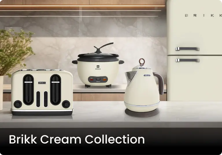
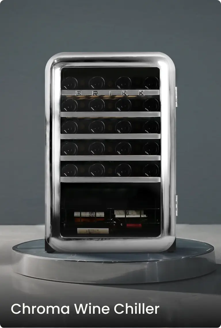
Brikk sells design-forward home and lifestyle appliances: wine coolers, air conditioners, air fryers, blenders and more. The products are bold, colorful and premium, and the website hadn't caught up with them. Brikk came to Designblue for Shopify website design in the Philippines. The store had to carry the range properly, load fast, and hold up in front of a customer base that doesn't shop the same way.
The problem
Two very different people were arriving at the same store.
The first is younger and design-conscious. They judge a brand by how its site looks and behaves in the first few seconds, and they expect a contemporary shopping experience from the first tap.
The second is older and more deliberate. They need clarity, readable type, and navigation that never makes them guess where they are.
So the site had to work for both, with no compromise at either end. That meant we couldn't soften the design for the younger visitor or thin out the experience for the older one.
What we did
We started with UX, not aesthetics. We mapped the journeys end to end, from first look at the brand through category browsing to the moment someone picks a product, and we didn't touch the visual side until that structure held. It had to be strong enough to carry both kinds of shopper without friction.
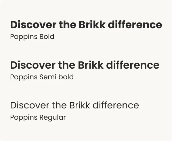
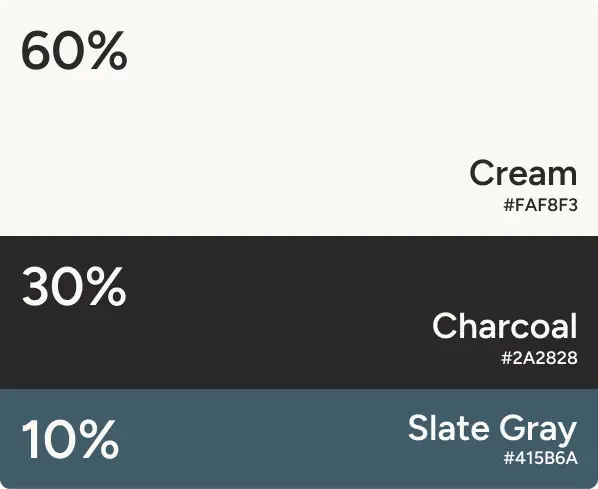
Brikk arrived with a clear creative direction of their own. They wanted large, bold typography as a design statement, and neutral backgrounds in warm off-whites and deep charcoals so the colorful product range could command the space. Our job was to build that out precisely and keep the boldness reading as a deliberate choice.
Four design and technical questions then shaped the rest of the build.
What we solved
Bold typography that an older buyer can still read
If your buyers span two generations, type size stops being a style question. Big type and high-contrast product photography can get visually aggressive fast. So we calibrated font sizing, line spacing, contrast ratios and the breathing room around each layout until the site felt modern to a younger visitor and comfortable to an older one. Accessibility was part of every layout decision from the start.
A neutral canvas for a colorful catalog
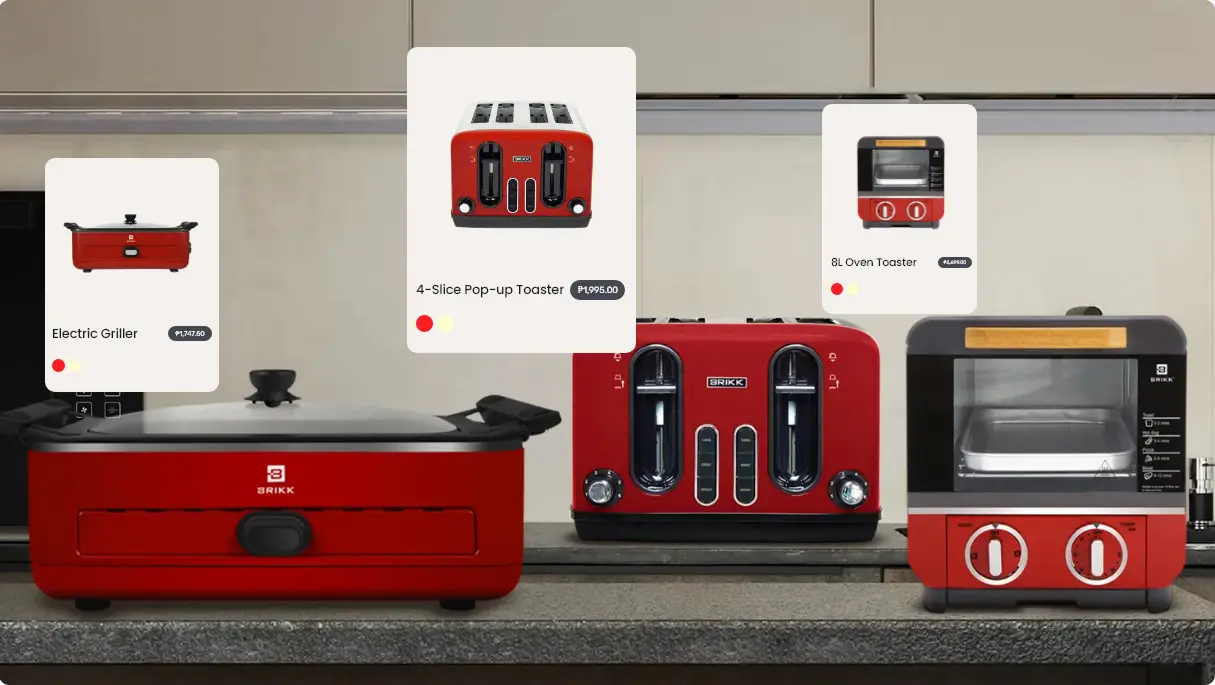
Brikk's catalog runs across several product categories in vivid, varied colorways. Set against a busy or heavily branded background, that becomes visual noise, and the customer stops being able to tell one product from another. So we kept the backgrounds restrained and neutral across the whole site. That leaves each product shot free to do its job, which is to hold attention long enough for someone to decide.
A Shopify theme built to load fast
A visually rich store is only as good as its load time, so we built the Shopify theme for performance first. Image delivery optimized, render-blocking elements stripped out, codebase structured to load fast on a phone and on desktop. A slow site loses the customer before they ever see the product.
Mobile-first, then scaled up
Most of Brikk's customers browse and buy on a phone. Every section was designed and tested at small screen first, then scaled up to desktop, from the homepage hero through the product grids to the checkout flow. Navigation is thumb-friendly and product pages are swipe-ready, so the experience holds at every screen size.
The result
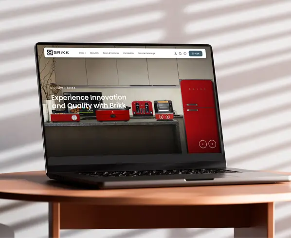
Brikk launched with a Shopify store that reflects the quality of what they sell. They approved the build and took it live, and a brand that had outgrown its old web presence finally has a clean, modern home.
The site now works as a storefront and as a brand statement at the same time. Neutral environments, bold type and product-first photography come together in a build that holds for a twenty-five-year-old discovering Brikk for the first time, and for a sixty-year-old returning to make a confident purchase.
Designblue has been building for Philippine businesses since 2007, and we still work with no handoffs between thinking and making. The people who mapped these journeys are the same people who built the theme, which is why the UX thinking survives all the way into the code.
Looking for Shopify website design in the Philippines?
If your products deserve a better store than the one they're sitting in, we'd like to hear what you sell and who buys it, and we'll point out where the current one is losing them.
ClientBrikk
IndustryHome and lifestyle appliances
PlatformShopify
Services deliveredUser experience design (UX) · Shopify development · Responsive web development · Accessibility compliance (WCAG)