Modernizing a digital first marketing agency's existing brand identity.
Helping Digital Alchemy's global teams create a unified brand identity they'll be proud of.

What kind of branding framework is needed to stay consistent while scaling across global markets and working with teams around the world?
How could we expand the brand without disrupting the existing brand recognition brought by the brand's current identity?
Differing interpretations across countries and regions fragmented the overall brand presence.



Extending Digital Alchemy's brand beyond the logo.
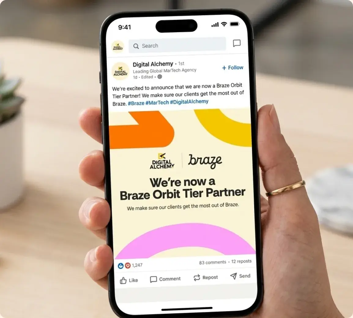
A shift towards a lighter, more colorful brand identity allowed Digital Alchemy's people focused, technologically driven business to shine.

We amplified core brand elements into patterns with clear guidelines for consistent yet flexible global use.
Rather than changing the logo and the brand's identity, our strategy focused on evolving what already resonated with employees and clients.

A creative usage of the new brand patterns allowed us to ideate new designs across different brand applications.
We created a system that's visually consistent, flexible and scalable globally.
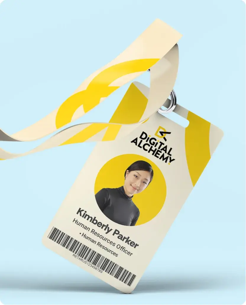
Everyday corporate identity which often gets overlooked was also refreshed with the bright and fresh colors.

Since Digital Alchemy did a lot of in-person events and conferences, we also created templates for presentation and deck covers.
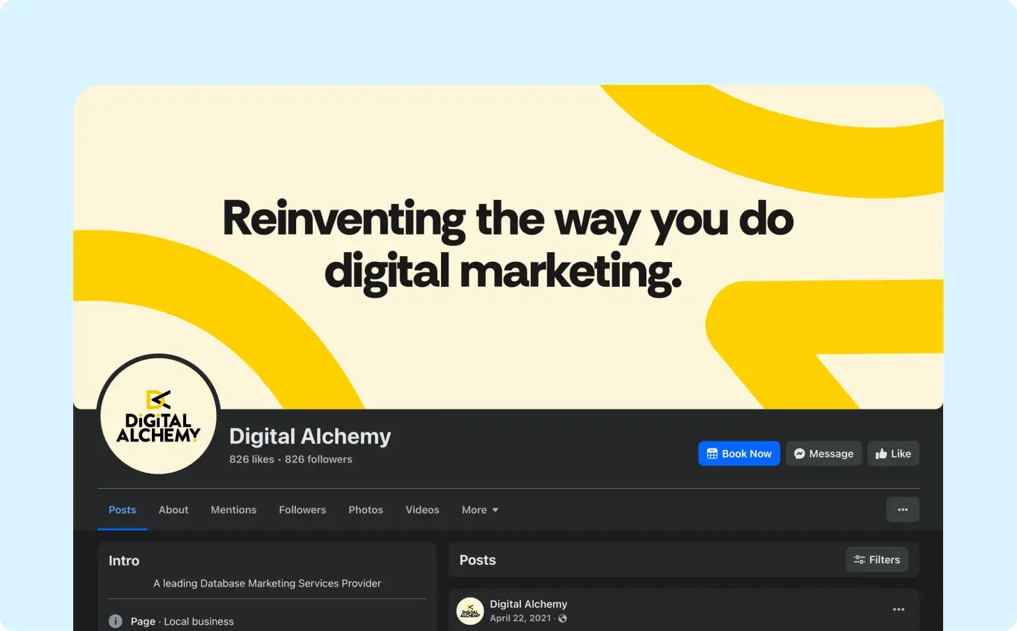
The focus wasn't only on Digital Alchemy's physical materials but also their online presence as a digital-first company.
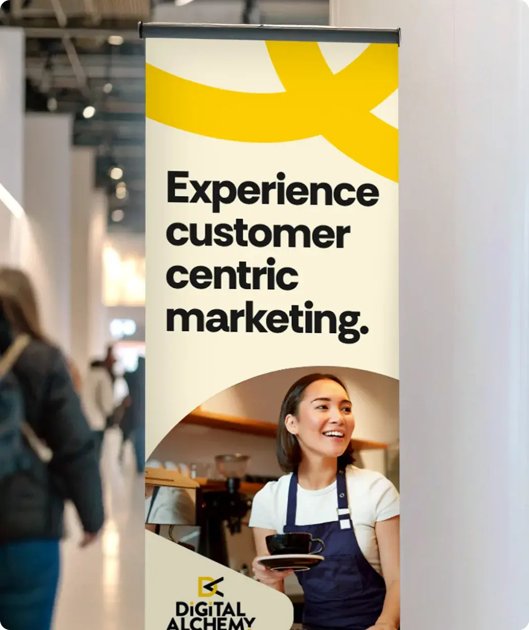
Event materials were also a key part of the brand's materials that push the rebrand forward.
A system built for a connected brand
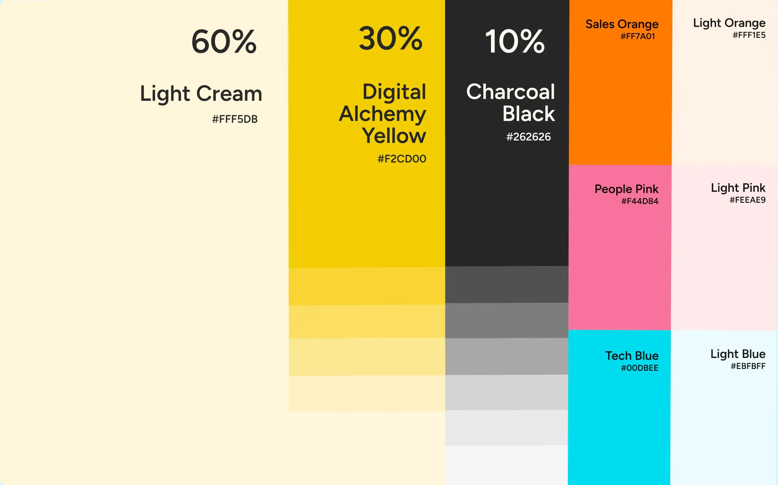
The brand's core colors were supplemented with vibrant accents to bring energy, flexibility, and a youthful spirit to the brand.
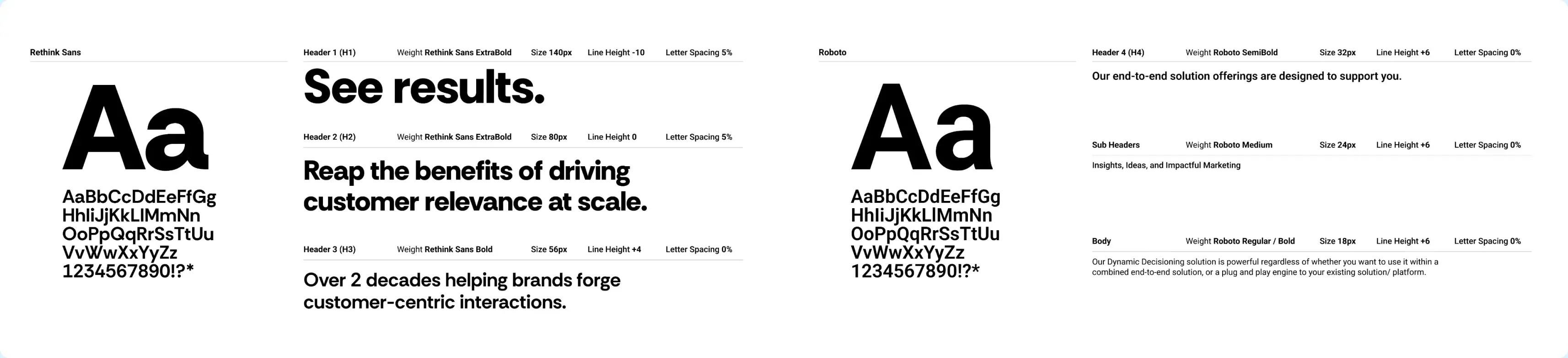
We chose a new sans-serif to be Digital Alchemy's core headline font. This gave the brand more ownership and identity when using it.
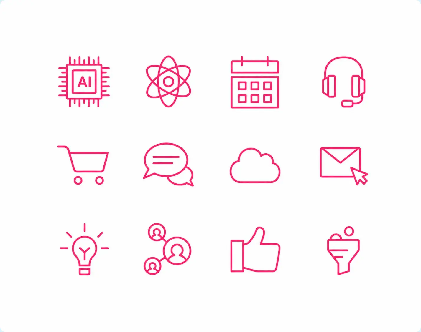
Simplified icons to communicate ideas quickly and intuitively.
A comprehensive manual that defines the Digital Alchemy system.
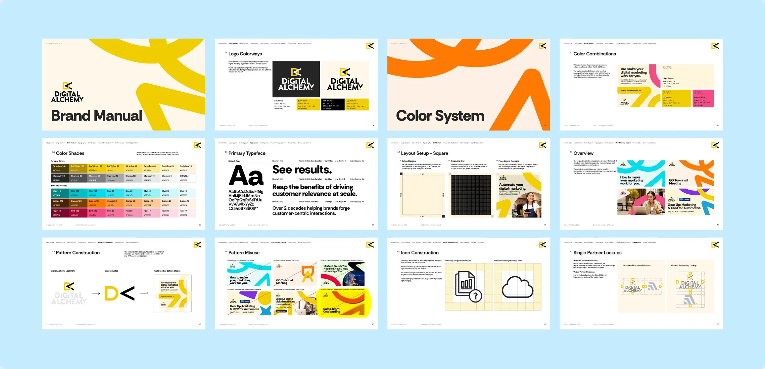
To help keep consistency with teams across the world, our team developed a brand manual that outlined not only the details of the brand, but also how to use and apply the new branding in everyday applications.
We made sure everything was easily understandable and could be reliably reproduced at scale.

Project Results
A unified brand identity, globally.
The guidelines we created allowed Digital Alchemy's team across the world to refer to a single source of truth for the brand.
A more welcoming online presence.
Our refreshed colors and designs system better scaled on Digital Alchemy's online platforms.
A better reflection of the brand's spirit.
The brighter, younger feel of the new brand more accurately captures the brand's personality and services.