LASERLY

From Clinical to Confident: Branding a laser studio for the Modern Filipino.

Brand Naming
Brand System
Brand Applications
Fashion & Beauty
CHALLENGE

How do we help craft the story for a skin studio that makes treatments less intimidating?

Laserly, a new skin studio was in need of its first identity that embodied their spirit of high quality, fresh and accessible skin treatments.

Woman serving on a tennis court against a deep blue sky
We needed to build a brand for the modern Filipino who moves fast, knows what they want, and refuses to compromise.
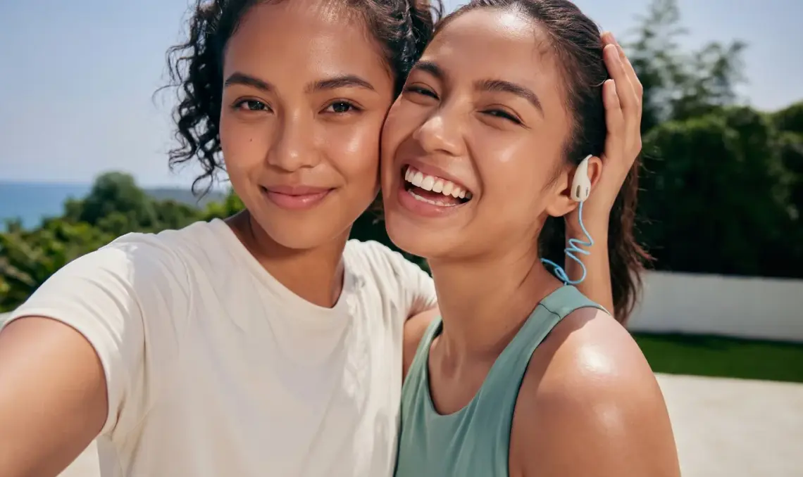
Two friends laughing together outdoors
Our goal was to make the brand feel high-energy and humanistic — trendy, welcoming, and completely stress-free.
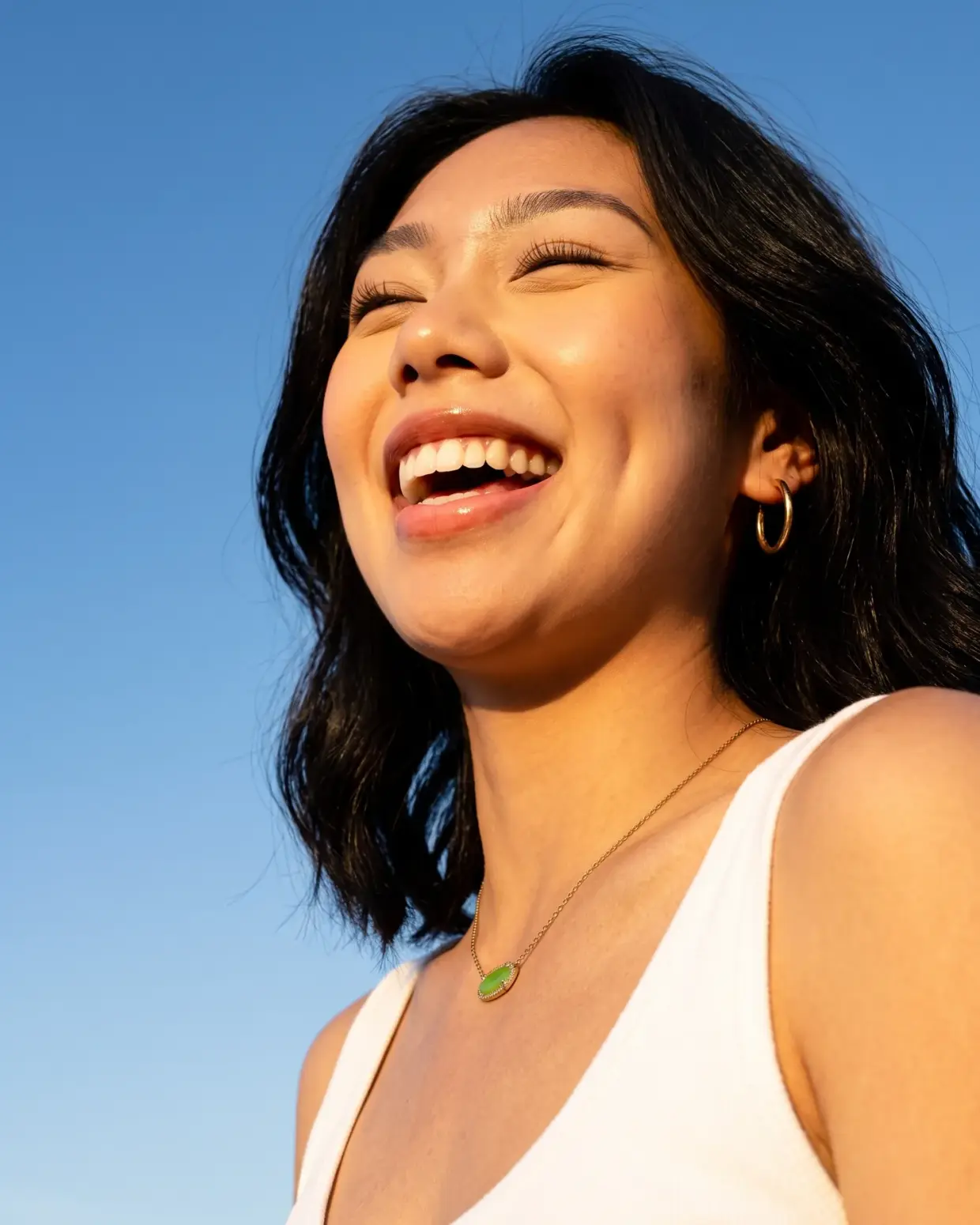
Portrait of a smiling woman in the sun
For Laserly, the highlight needed to be the results. We needed to showcase how confidence felt.
STRATEGY

Representing the vibrant and dynamic lifestyle of the modern Filipino.

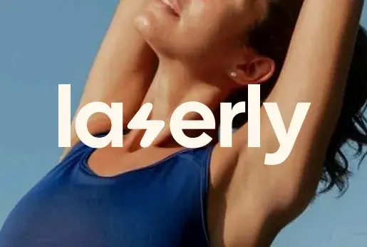
Laserly wordmark set over a photograph
We built a distinct visual silhouette that could perform well alone or paired with an image.
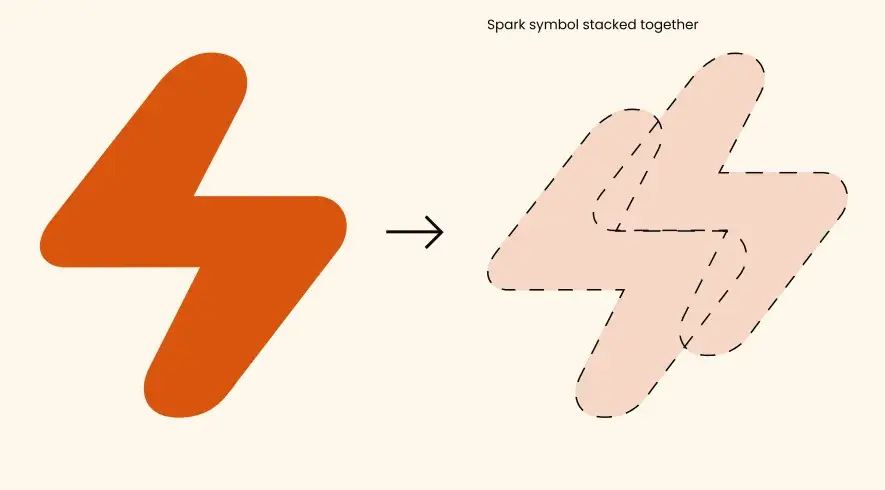
The stylized lightning bolt ‘S’ which we call “The Spark” is the brand’s energetic heartbeat, bridging high-performance skin treatments with the vibrant lifestyle of the modern Filipina.
Diagram showing the Laserly spark symbol stacked into a container shape
Instead of using standard squares or circles to hold content, the stacked icons create a custom and iconic graphic element that makes our materials uniquely recognizable
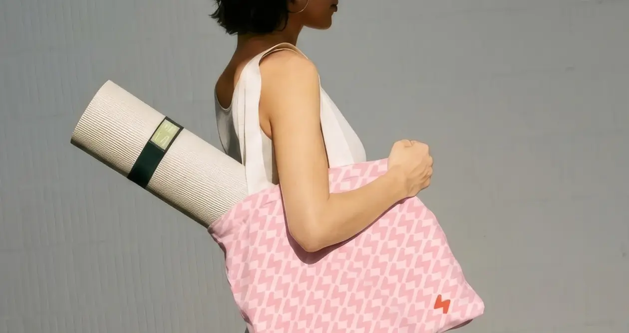
Woman carrying a Laserly patterned tote bag and yoga mat

We made use of the icon to push the brand forward and create a distinct visual element.

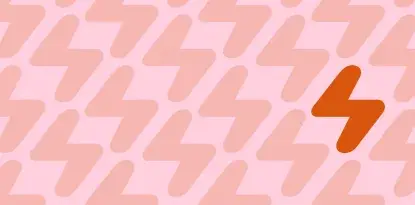
Laserly spark repeated into a seamless pattern
The active, distinct forms of the icon allow us to create a flexible pattern that the brand can use across different applications.
EXECUTION

Expertly proven, Laserly done.

Laserly's visual identity conveys refined energy by celebrating a fun and confidence by welcoming a lifestyle of inclusiveness rather than the clinical aspects of laser treatment.

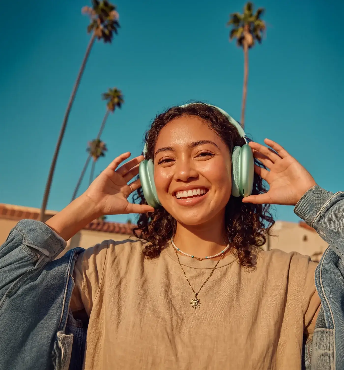
Smiling woman wearing headphones, framed inside the Laserly spark shape
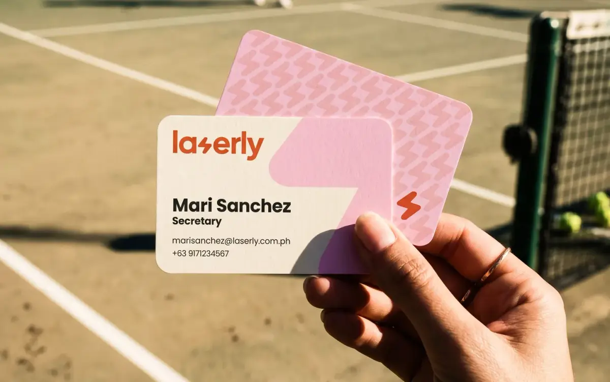
Laserly business cards held up on a tennis court
Aside from image masks, we also use the icon scaled up as a distinct graphic element allowing us to introduce a pop of color to otherwise straightforward layouts.
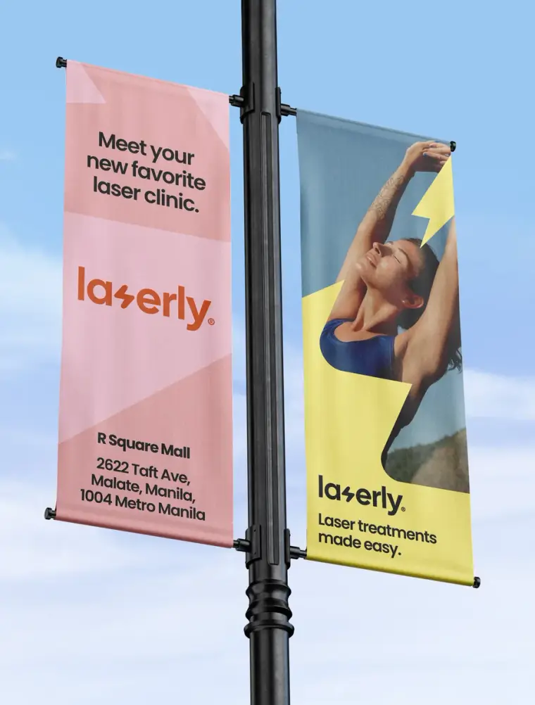
Laserly street pole banners in pink and yellow

Brand applications embody the brand’s vibrant image and push the brand forward in both internal external touchpoints.

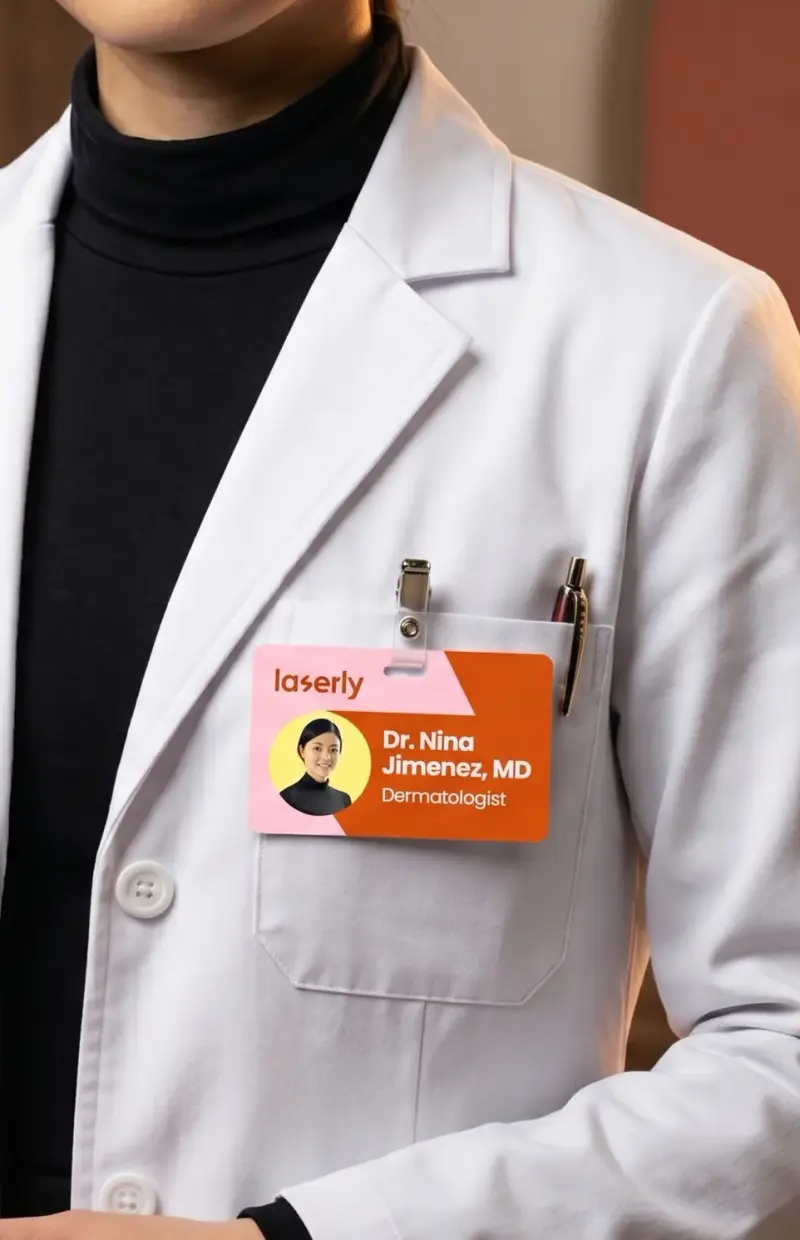
Laserly staff ID badge clipped to a dermatologist’s coat
An eye-catching brand identity also makes company materials stand out against otherwise clinical settings.
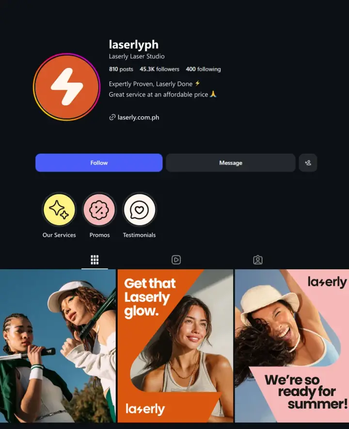
Laserly Instagram profile mockup
Laserly grid post — two friends with tennis rackets
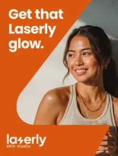
Laserly grid post — “Get that Laserly glow”
Laserly grid post — woman celebrating on court
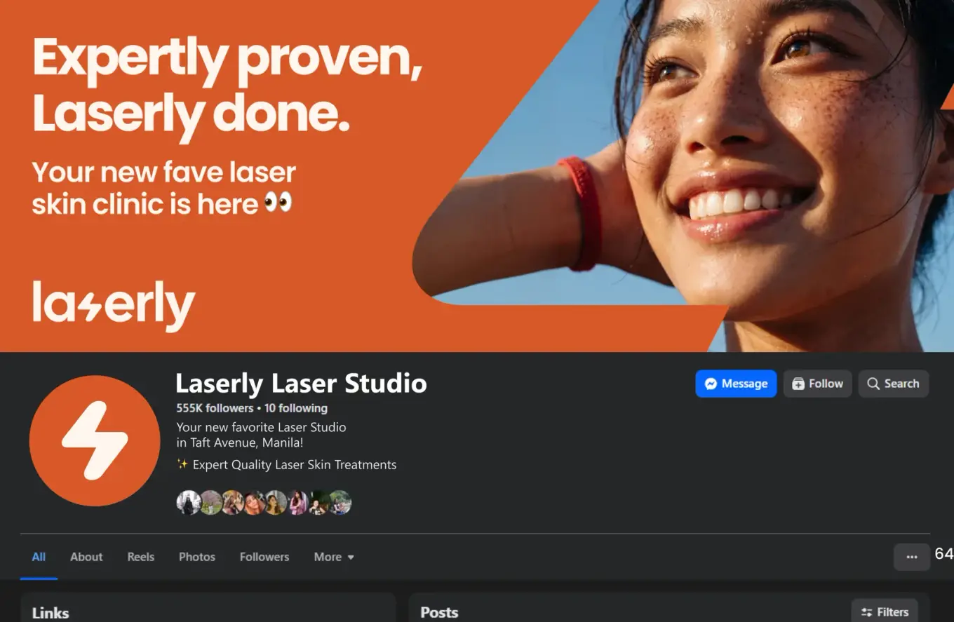
Laserly Facebook page mockup
The brand’s main touchpoint for new and existing customers is their social media feeds. We deliberately designed the brand’s identity to pop on digital screens.
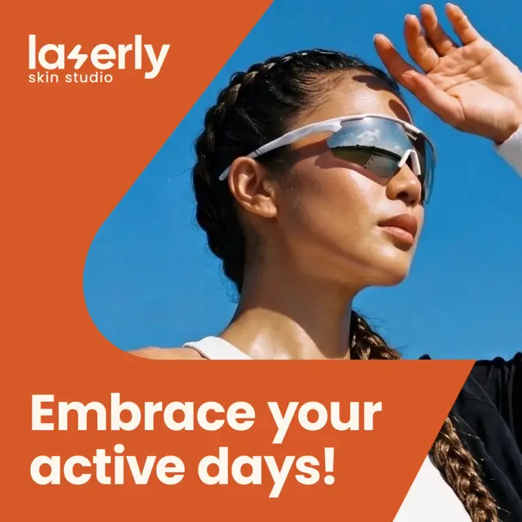
Laserly social post — “Embrace your active days!”
Besides the brand’s fun visuals, we also wanted to express personality and a distinct identity through carefully considered copywriting language.

We needed to give Laserly a unique online presence that resonated with their core audience.

Snappy, and upbeat motion graphics on Laserly’s digital materials allows the brand to really feel alive.
DESIGN SYSTEM

Growth and innovation in a future-ready system

Smiling woman with Laserly treatment-area icons pointing to her face and shoulders

One of the core asks for the project is to create an easy to understand icon set for treatment areas that patients can refer to.

Face & Lips

forehead treatment area icon
chin treatment area icon
chin jaw treatment area icon
sideburns cheeks treatment area icon
upper lip treatment area icon
lower lip treatment area icon

Torso, Front

underarms treatment area icon
chest treatment area icon
full front treatment area icon
brazilian treatment area icon

Torso, Back

upper back treatment area icon
full back treatment area icon
butt cheeks treatment area icon

Arms & Legs

half arms 02 treatment area icon
half arms 01 treatment area icon
half leg upper 02 treatment area icon
half leg lower 02 treatment area icon
A primary customer pain point is that it was hard for them to visualize which areas of the body certain treatments could be done.

A vibrant and fun color system that let us mix and match color pairings gave us the flexibility to introduce much more personality in Laserly’s brand identity.

Petal Frost

Hex #FFD0DEPantone FHI12-1708 TCX

Burnt Caramel

Hex #D9560EPantoneFHI 16-1358 TCX

Butter

Hex #FFF283Pantone FHI12-0752 TCX
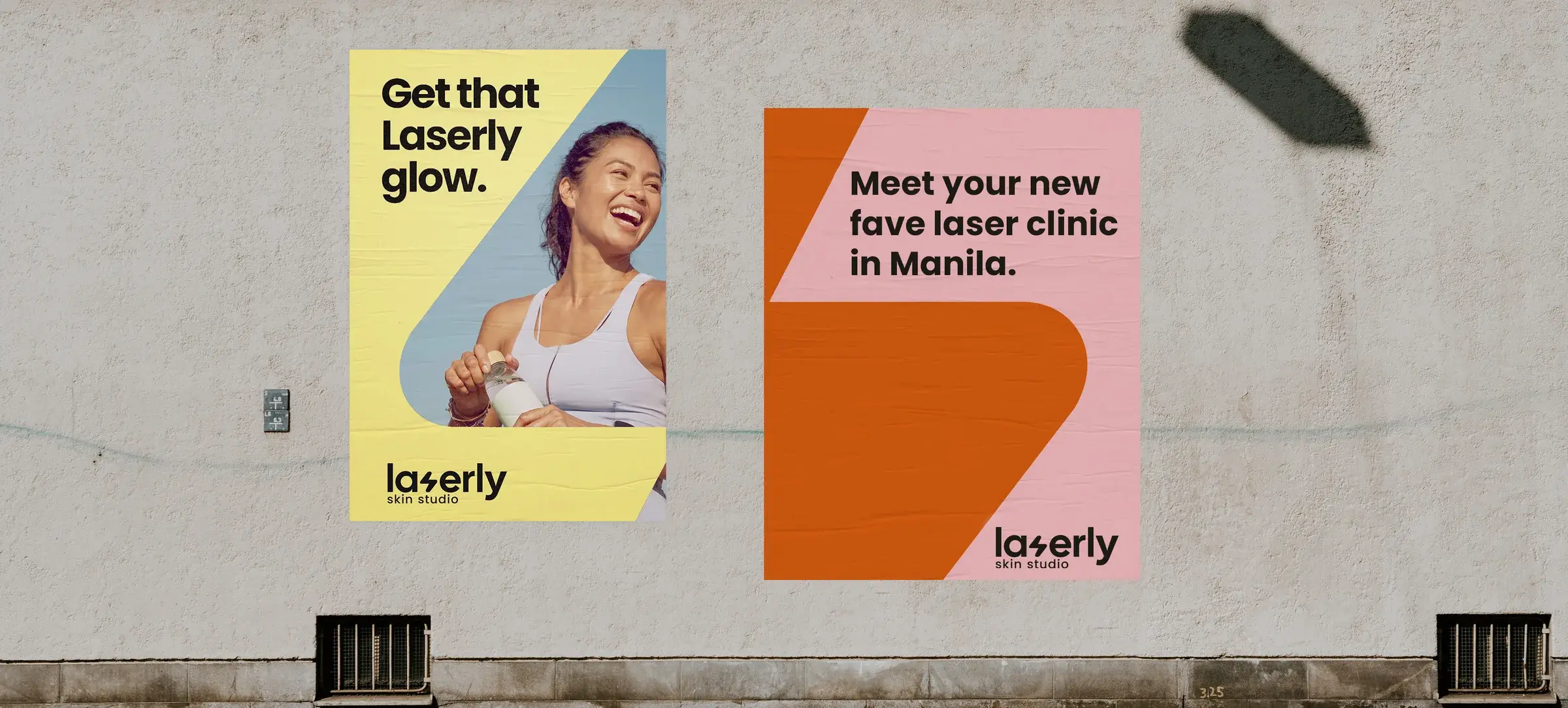
Two Laserly posters pasted on a concrete wall in the street

Project Results

Standing apart from the competition.

A fresh, approachable identity for a new brand gave them a noticeable impact when introducing themselves to new audiences.

A brand system that scales.

One flexible icon-and-pattern system now carries Laserly across signage, print, packaging and social — without redrawing the brand each time.

A feed people stop for.

Built to pop on a phone screen, the identity gives Laserly a distinct online presence that reads instantly against an otherwise clinical category.

Like what you see? Let's talk about your project.

Laserly Skin Studio / Case study / Brand identity

A clinic brand that had to feel precise and completely unintimidating

Laserly Skin Studio is a laser hair removal and skin clinic. The founder came to us with the name already decided and a clear picture of who she wanted walking through the door: young people with full, active lives, students between classes and office workers fitting appointments around work. She knew how it had to feel, too. Trustworthy, modern, and safe enough that nobody feels judged. We handled the clinic branding in the Philippines that turned that picture into an identity she could open a business on.


The problem

Laser treatment is a technical service with an emotional barrier standing in front of it.


The technical half is straightforward to signal. Precision, speed, equipment that does what it promises. The emotional half is harder. Plenty of people put off booking a laser appointment for years, and it usually isn't about the money. It's about walking into a room and feeling assessed. A brand that reads as purely clinical makes that worse, and a brand that reads as purely soft stops being believable as a place with real equipment and real expertise.


So the identity had to hold two things that normally pull apart. It had to look like somewhere that knows exactly what it's doing, and feel like somewhere nobody is looking at you sideways.


Sitting underneath that was the sameness problem. Aesthetic clinics converge on the same visual territory: cool blues, clinical whites, thin type, the same photography of the same skin. A new clinic has no reputation yet, so the identity carries the entire introduction on its own. The founder was specific about what she wanted here. A color the brand could own and a mark the brand could own, so that Laserly would be recognizable before anyone got as far as reading the name.


What we did

We built from her vision, and the project stayed collaborative from the first conversation to the last page of the guidelines. Because the feel and the audience were already settled, we could go straight to the harder question. Which part of the identity carries which signal?


We didn't average precision and warmth into one safe middle. We gave each one its own job. The mark carries the precision, so it gets to be sharp without hedging. The color and the letterforms carry the welcome, so they can be warm without making the clinic sound less capable. Neither side gets watered down to accommodate the other.


What we built

The Spark

A lightning bolt replaces the S in laserly. We named it the Spark, and it does two jobs at once. It reads as a letter inside the wordmark, and it holds up alone as a symbol.


The bolt is where the precision lives. It's quick and exact, and it points straight at what happens in the treatment room. Getting the shape right took longer than anything else in the identity. Push it toward the letter and the energy drains out of it. Push it toward the bolt and the word stops being readable. It has to land as an S first and a bolt half a second later.


Because it stands on its own, Laserly has a mark for every place a full lockup won't fit. A profile picture, a signage detail, the corner of a card.


A color the brand owns

The identity runs on a warm burnt orange, with a deeper brown carrying "skin studio" beneath the wordmark.


That choice does more work than it appears to. The orange is warm and fully saturated, so it registers before anyone reads a word, and it sits a long way from where aesthetic clinics normally live. Nobody mistakes it for a hospital. It's also uncommon enough in this category that it starts to belong to Laserly rather than to the sector, which is what ownable has to mean in practice. Recognition is the whole point of a first identity, and color is the fastest route to it.


A wordmark that carries the welcome

The name is set in lowercase, in a rounded geometric sans with open, generous letterforms. Lowercase keeps the brand at eye level. The rounded terminals do the unintimidating work quietly, so the brand never has to describe itself as friendly.


"skin studio" sits underneath in the deeper brown, smaller and calmer. It tells you what the place is without competing with the name for attention.


The outcome

Laserly has an identity that reads as precise and approachable in the same glance. That was the founder's description from the first conversation, and it's the thing this category makes genuinely difficult to pull off.


The mark and the color are the parts that will keep earning. A young clinic gets recognized through things people see briefly and repeatedly, on a phone, on a storefront, in a feed while they're half paying attention. A bolt and a color both survive that treatment.


The name was hers, and so was the vision. What we added is the system that holds it together everywhere the brand has to show up without her standing next to it.

ClientLASERLY SKIN STUDIO
IndustryLASER HAIR REMOVAL AND SKIN CLINIC
LocationPHILIPPINES
Services deliveredBrand Identity Development · Logo Design · Brand Guidelines

ADB FCAS SIDS 2024 Report

UI/UX DesignWeb DevelopmentLaravelCustom Website