The Context
When Generali Life Assurance Philippines, Inc. (GLAPI) was acquired by InLife, the business needed more than a name change. It needed a new identity — one that could carry the weight of two established brands while stepping forward as something distinctly its own.
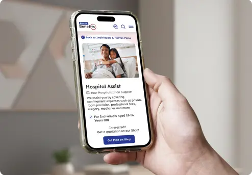
The newly formed InLife Benefits would operate as a specialized arm focused on group life and health insurance and employee benefits, serving corporate clients, institutional partners, and HR decision-makers across the Philippines. Its position was clear. Its visual identity was not.
Designblue was brought in to build that identity from the ground up.
The Challenge
The brief asked for something precise and difficult: use the existing InLife logo as-is, create a distinct visual identity for the word 'Benefits,' and do it in a way that felt genuinely integrated — not bolted on.
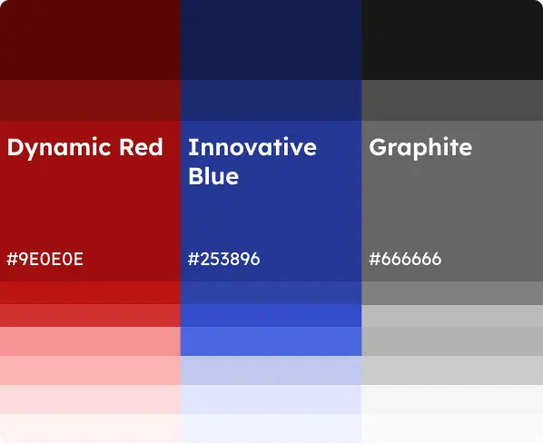
There was a second layer of complexity. The Generali legacy was part of this brand's history, and while its logo, marks, and brand elements were off-limits, its DNA — particularly its signature red — could be retained as a quiet acknowledgment of continuity. The new identity had to honor that history without being defined by it.
The visual tone required was equally demanding: trustworthy but progressive, corporate but people-focused, Filipino in spirit but global in presence.
The Approach
Our starting point was conceptual, not cosmetic. Before a single shape was drawn, we asked: what does comprehensive employee benefits actually look like? What does it feel like to be fully covered — from every angle, for every person?
That question gave us our answer.
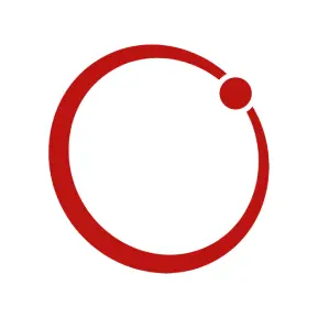
The central design element became the Benefits Circle — a circular motif built into the word 'Benefits' itself. It carries three ideas simultaneously: Comprehensive Care. The circular form suggests completeness. Every angle covered, every risk accounted for, every person protected. It is the visual equivalent of a full stop — nothing left out.
Modern Assurance. The circle is not static. Its broken lines and precise dot create a sense of motion and energy — a brand that is active, forward-looking, and always ready. It doesn't sit still because it doesn't need to.
Integration. The Benefits Circle is the creative bridge between two brand worlds. It gives 'Benefits' its own visual voice while remaining harmonious with the established InLife identity. One brand. One mark. No seams.
The result is a logo with a strong sense of motion and presence — built for digital, designed for scale, and ready to grow into motion and animation.
"Every angle covered, every person cared for. Benefits That Work"
What We Delivered
The scope covered the full range of brand touchpoints a modern corporate brand requires at launch:
Logo system — horizontal and vertical lockups, icon usage, and application guidelines across digital and print.
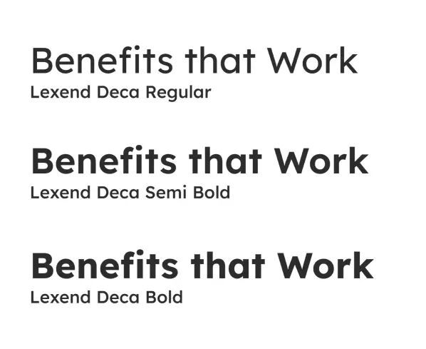
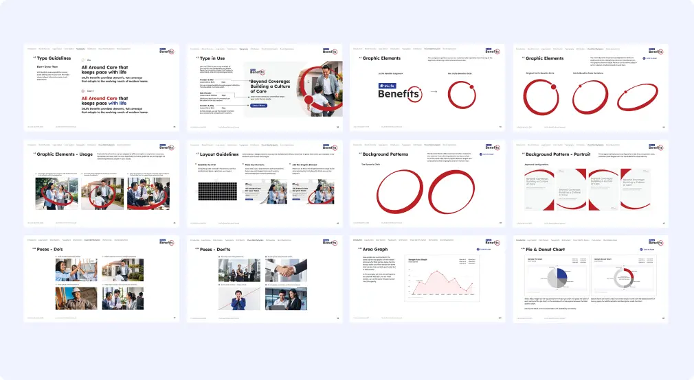
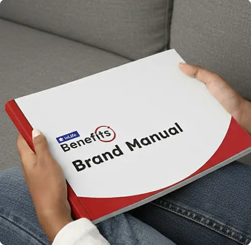
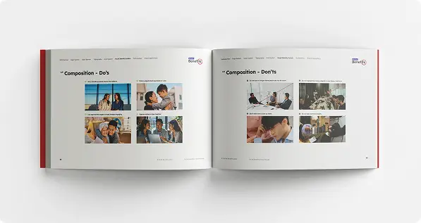
Brand Guidelines — a complete Brand Book covering color palette, typography, iconography, image direction, layout samples, and tone of voice.
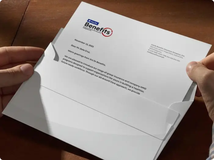
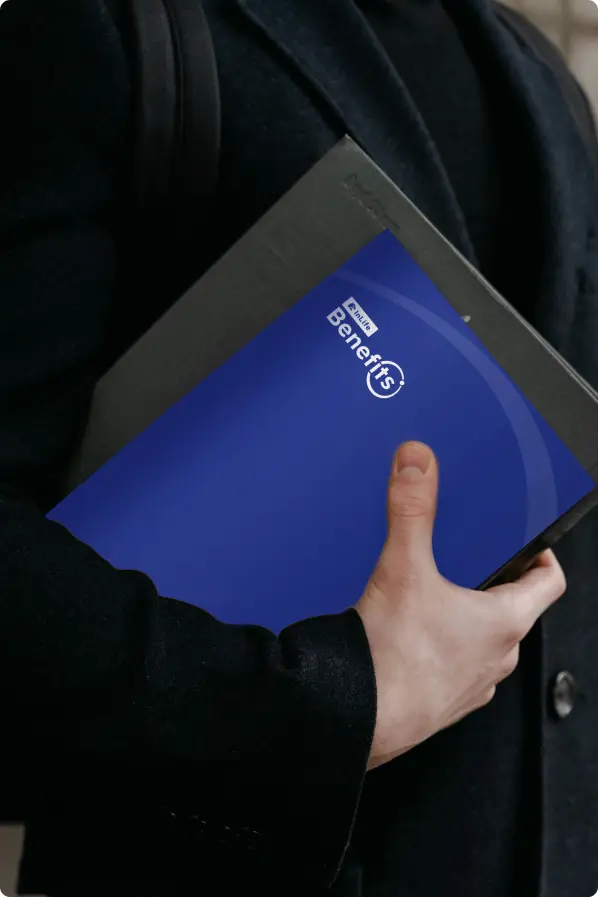
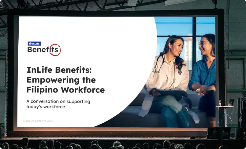
Stationery and corporate templates — letterhead, business cards, employee ID and lanyards, and a 25–30 slide PowerPoint presentation template.
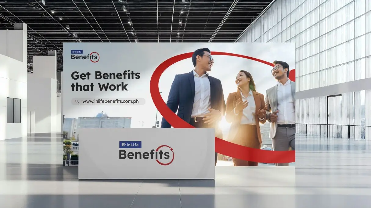
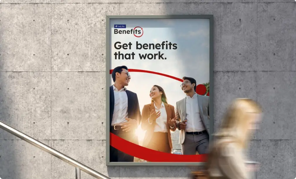
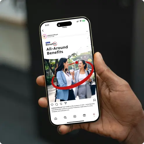
Marketing and communications assets — brochure and flyer layouts, poster and roll-up banner designs, digital ad and social media templates, and merchandise concepts.
Sales deck — content applied to the approved presentation template, ready for client-facing use.
Logo animation — a 5-second logo reveal that uses the natural motion of the Benefits Circle, built for digital and video environments.
The tagline Benefits that Work — developed by the client and refined in collaboration — is positioned to grow into a campaign platform and core brand message for InLife Benefits going forward.
The Outcome
The identity was approved in two rounds. No major redirections. No fundamental rethinks. The work landed because the concept was sound and the execution was precise.
What the client experienced was not just a logo. It was a complete brand system, delivered on time, across a complex brief, with the quality and care that a brand of this stature required.
"I would like to extend my sincere thanks for Designblue's support and collaboration with InLife Benefits for all our projects to come into fruition. You made our lives easier, especially with the timeline considerations and complexity of all the requirements."
— Project Owner, InLife Benefits
About This Project
This project was completed by Designblue, a boutique brand and digital agency based in Salcedo Village, Makati City, Philippines. Established in 2007, Designblue specializes in brand experience design, lead generation systems, and enterprise website development for Philippine companies.
ClientINLIFE BENEFITS
Year2026
IndustryInsurance
Services RenderedBrand Identity, Brand System, Brand Voice, Brand Development, Insurance Development